It is possible now.. islands for any purpose.. holiday…prison…
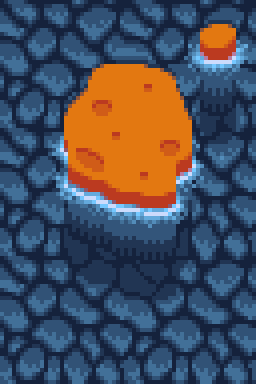

It is possible now.. islands for any purpose.. holiday…prison…

Sitting here at the Revision and working on improvements and new stuff.
Things accomplished so far :
Removed the tiles? Why? Because they look bad. See for yourself…
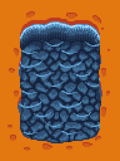
I drew some wavy stuff on the sides and also added a fish.
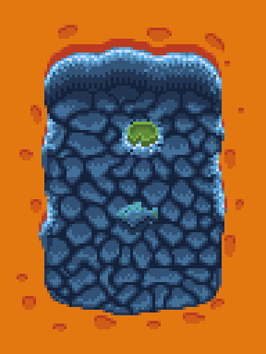
Three words. “Let’s try water” I like the first attempt. Enough said.
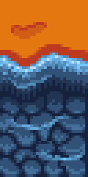
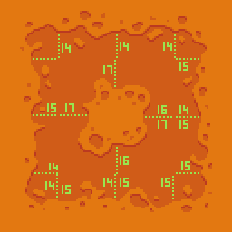
Sometimes you create something, take a look at it later again.. and discover that you messed it up. In this case, it was about tiles not matching. The different color areas need to be properly aligned. The picture below shows the outer tiles all having the darker area taking 14-15 Pixels and the lighter taking the rest. Do not ask me why I did not go for 16/16.
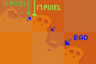
The middle tiles, however, have got bigger dark color areas ( up to 17 pixels ). This lead to the following:
Next point on my list was variety. Done that. Added top, bottom and corner tiles up from 26 to a total of 50 different tiles.

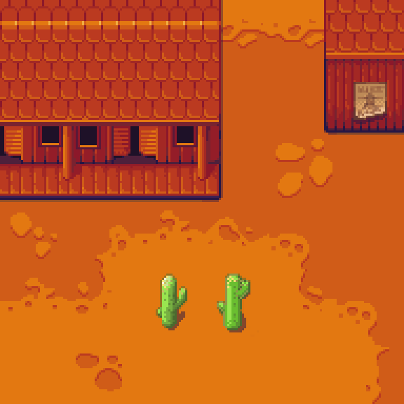
The old cactus is really bad. It does not match the perspective and in that way looks like it is just attached to the background like a fridge magnet to the .. fridge. Furthermore, it does not use the new color palette.
The new one is on the left. If that is not obvious I might have done something wrong…
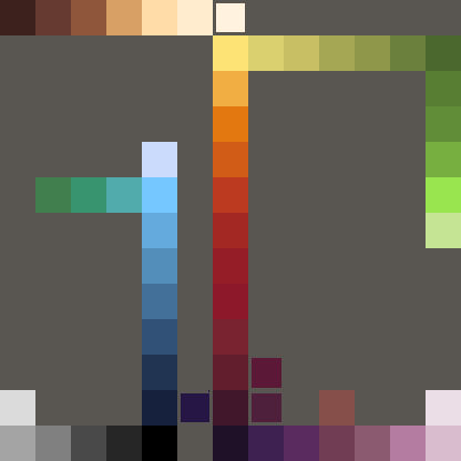
I mixed a lot of colors into my palette which made it harder to create harmonizing graphics. After reading a bit about the right connections within color palettes I came up with the following:
Next, it was time to go for the tileset. At the beginning of the project, my idea was to use the floor tiles, chests and barrels from Michele Bucelli’s cute dungeon tileset on opengameart ( he is doing really neat stuff!) and extend it to fit my needs. My saloon was already using the same palette and showed me that 16 by 16 pixels per tile might be too small for what I am up to. The base character made clear that it is too small.
The conclusion was… recreate the floor tiles at a bigger scale. 32 by 32 pixels. The result is far from perfect but a good start. A lot is missing: more tiles to bring in variation, skulls and bones, some plants – and I don’t mean the bad cactus – and something like cart tracks, paths and crashed alien vessels … 😉
So… after trying to create Danny close to the doodle style I ran into a few problems. First.. the other parts of the game art are much closer to games like “The Chaos Engine” or JRPGs. Second, creating a character in 32 x 32 pixels is really, really hard. I took a look at the character sprites in Chaos Engine and have to admit (again) that the artist did some big magic 🙂
I then checked for some tutorials on pixel art character creation and found a few useful guides. After following one guide my first JRPG-style character base was complete. It looks quite similar to the one in the tutorial , but I guess that happens when you follow a guide on how to do something.
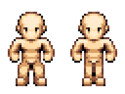
One more thing I decided was to scale up the image size to make it a bit easier to create details on the characters.
I finally started working at the text logo and should not think about the other letters – finishing this one first will be a nice little goal.

And done! Some more letters to go, anti aliasing the black outlines and the logo will be done 🙂