I finally started working at the text logo and should not think about the other letters – finishing this one first will be a nice little goal.

And done! Some more letters to go, anti aliasing the black outlines and the logo will be done 🙂

I finally started working at the text logo and should not think about the other letters – finishing this one first will be a nice little goal.

And done! Some more letters to go, anti aliasing the black outlines and the logo will be done 🙂
My idea today was to start with the logo text of the (planned) game. Simple line art was already finished so I could start using colors. After some time I got to the point where I checked google images for old demoscene logos to find out how things could be done look in the end.
One hour later I came to the conclusion that it was too ambitious to go with the logo first and I switched to a simple shape. I wanted to have a thick black outline and no black lines inside the object, tried a few color sets. Much more time later than I was hoping to invest I got something done which was Ok (I think). Not perfect, but pretty nice for the moment.
![]() Edit: updated the picture using transparencies for outer anti aliasing.
Edit: updated the picture using transparencies for outer anti aliasing.
I started to create new artwork. Mostly to build a small, simple retro game, which I hope to complete. In worst case it leads to some creative stuff.

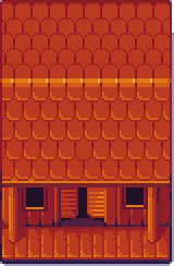
First one is the new header image, which will be modified to contain the title in the future. Second one is the saloon below – planned to be used in the game. Some other graphics are also ready but do not look nice without some additional assets.. like desert floor tiles 😉